Given two curves, a baseline and a candidate curve, how do we know how similar they are to each other? In machine learning, it is common to compare the predicted values (candidate curve) of a testing set to the true values (baseline curve) by RMSE (Root Mean Square Error). By comparing RMSE values of different candidate curves, we can learn which one is more similar to the baseline curve and thus identify the machine learning model that performs the best.
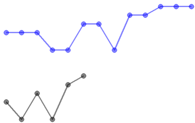
What if the two curves have different number of points on a different range (where it starts and ends)? Considering different people speaking the same sentence, different people speak in different speed (range), pitches (values) and so on, however, they make very similar sound (as it is the same sentence). This leads to two temporal sequences (curves) with different number of points and values at each point. If we continue to use RMSE metric to measure the difference between the two curves, we will not be able to calculate a point-wise value difference. An algorithm to compare curves like these is Dynamic Time Warping (DTW). It associates points from candidate curve to the baseline curve so that the total distance of the formed path (warping path) is minimal. The distance is a measure of their similarity and can be used to compare similarities of different candidate curves to the baseline curve.
Dynamic Time Warping
DTW first calculates a distance matrix with each cell value being the distance between two points from baseline and candidate curve respectively. Using this matrix, we can find the path that has minimal distance.

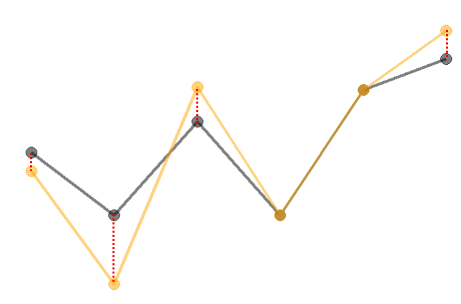
By connecting the points with a dashed line (connectors) based on the warping path, we can visualize the association between the two curves. Averaging the length of each connector, we can get a DTW score for the dis-similarity between the two curves since a more similar candidate curve will have a smaller DTW score. By going through the algorithm, DTW allows for stretching or compressing one curve relative to the other to find the optimal alignment of their points.
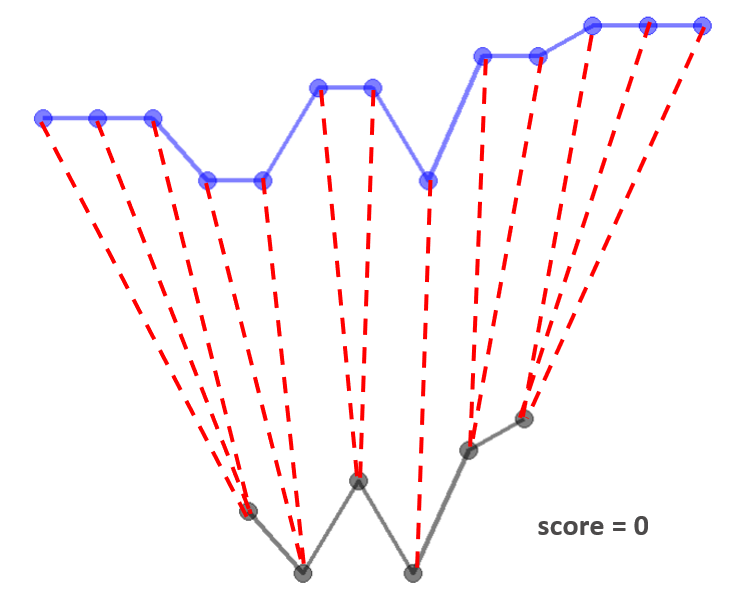
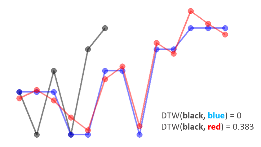
Now we can use the DTW score to compare (dis)similarities between different candidate curves to the baseline curve. Given the two candidate curves (blue and red), we can see that blue curve is more similar to the baseline (black) curve than the red curve. We expect red curve will have a larger DTW score and the DTW scores aligns with our expectation.
Partial Dynamic Time Warping (pDTW)
It is not hard to notice some problems of the alignment from the visualization of the alignment between the baseline and candidate curves. First of all, since there are different number of points for the two curves, a candidate curve with more points has an disadvantage. Secondly, multiple points from candidate curve are aligned to one single point from the baseline curve (redundant connectors). This indicates that the candidate curve is “longer” than the baseline curve (incompatibility). In the speech recognition example, if one person speaks a longer sentence, it won’t be a fair comparison anymore. Here we can use the help from Partial Dynamic Time Warping (pDTW). pDTW still uses the core algorithm of DTW method with a few additional processes to work with the two problems we observed.
Before the DTW computation, pDTW interpolate the candidate curve so that it has the same number of points as the baseline curve. After each alignment from DTW computation, if there is any redundant connectors at either end of the baseline curve, points from candidate curve will be removed. In order for the candidate curve to have the same number of points after removing the redundant points, interpolation is performed on the candidate curve. This process is repeated until there is no redundant connectors in the DTW alignment. Then, it returns the DTW score.
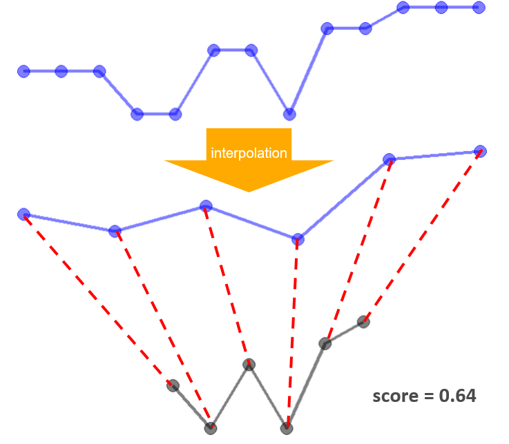
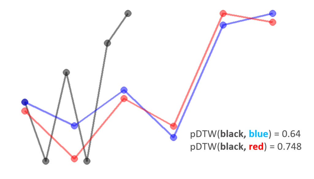
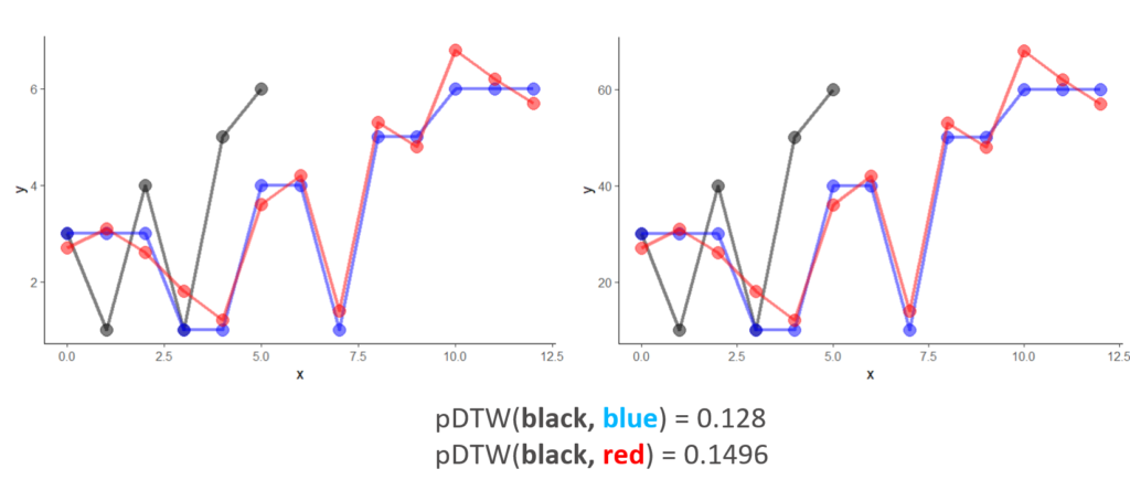
With these changes, our updated algorithm still suggests the red curve is less similar to the baseline curve compared to the blue curve.
Normalization
Finally, scaling of the curves due to the engineering considerations happens all the time. The scaled curves have the exactly same shape as they did before and their relative position to each other remain unchanged. However, as the DTW algorithm measure the difference directly from point values, we will get a different score. This can be taken care of by adding a normalization procedure before pDTW computations. We normalize the baseline curve so that the baseline curve is in a unit box (a [0, 1]*[0,1] region) with vertical and horizontal scale factors. With the same scale factors, we scale the candidate curve. Thus, the candidate curve may not entirely lie on or within the unit box. The advantage of this normalization process is that as long as we are comparing candidate curves to the same baseline curve, we can normalize the curves however we want, it is not going to affect their relative positions and shapes and thus provides a consistent DTW score, as demonstrated below.
Compare Curves in d3VIEW Workflow
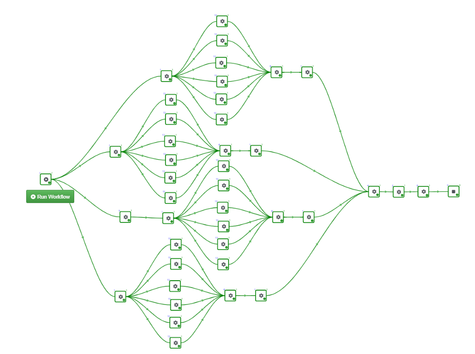
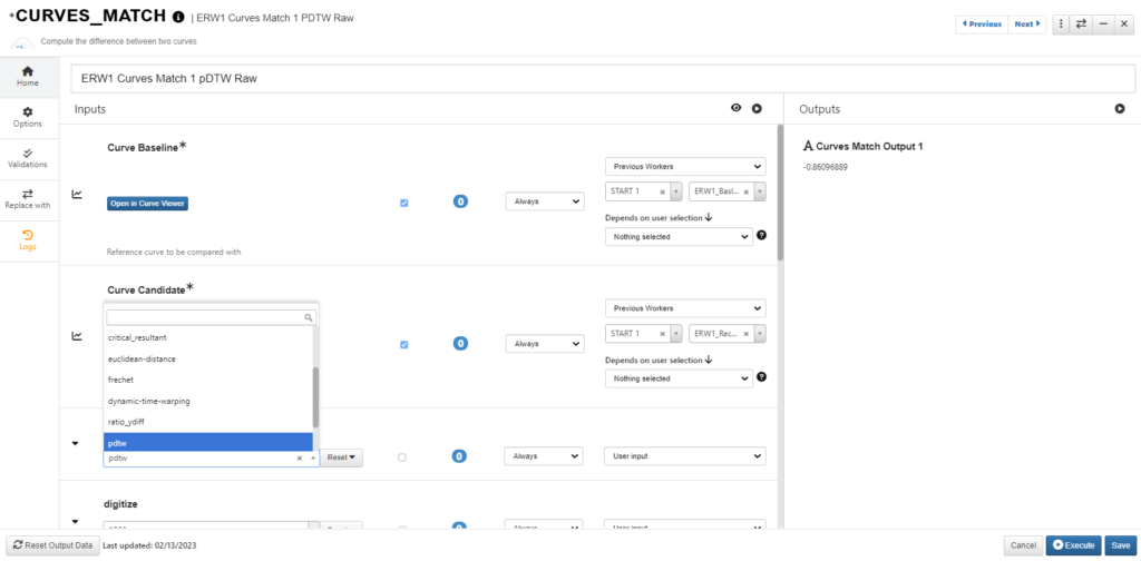
In d3VIEW Workflow, there is a Curves_match worker that provides a variety methods for comparing curves. We can choose “pdtw” to calculate the pDTW score.
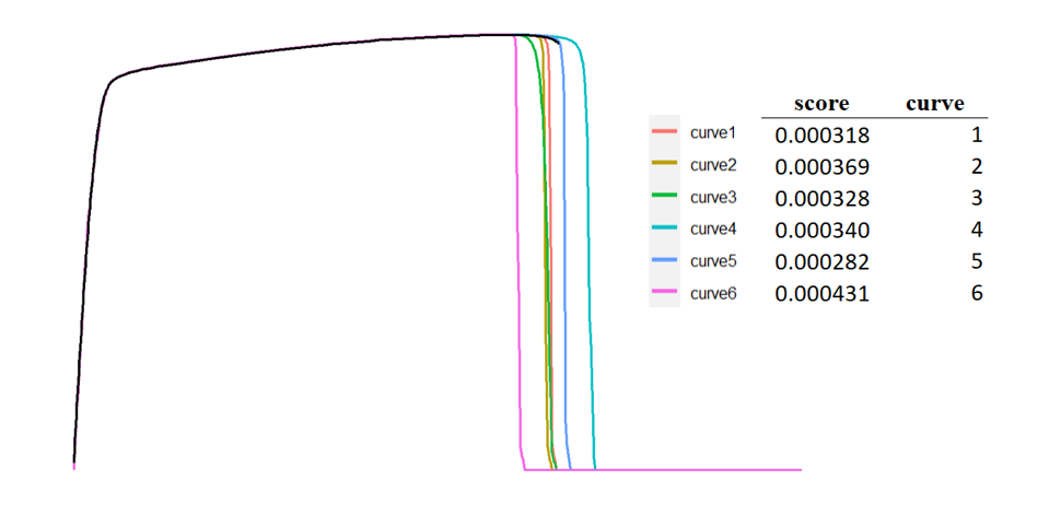
Here we have one test curve (baseline) and 6 simulation curves (candidates). We want to compare each candidate curve and see which one is most similar to the baseline curve. We calculate a pDTW score for each candidate curve with the baseline curve and compare the pDTW scores and identify the curves that are most and least similar to the baseline curve.
From the output, we can see that, curve 5 and curve 1 are most similar to baseline curve and curve 6 is least similar. This result matches our subjective perception.
