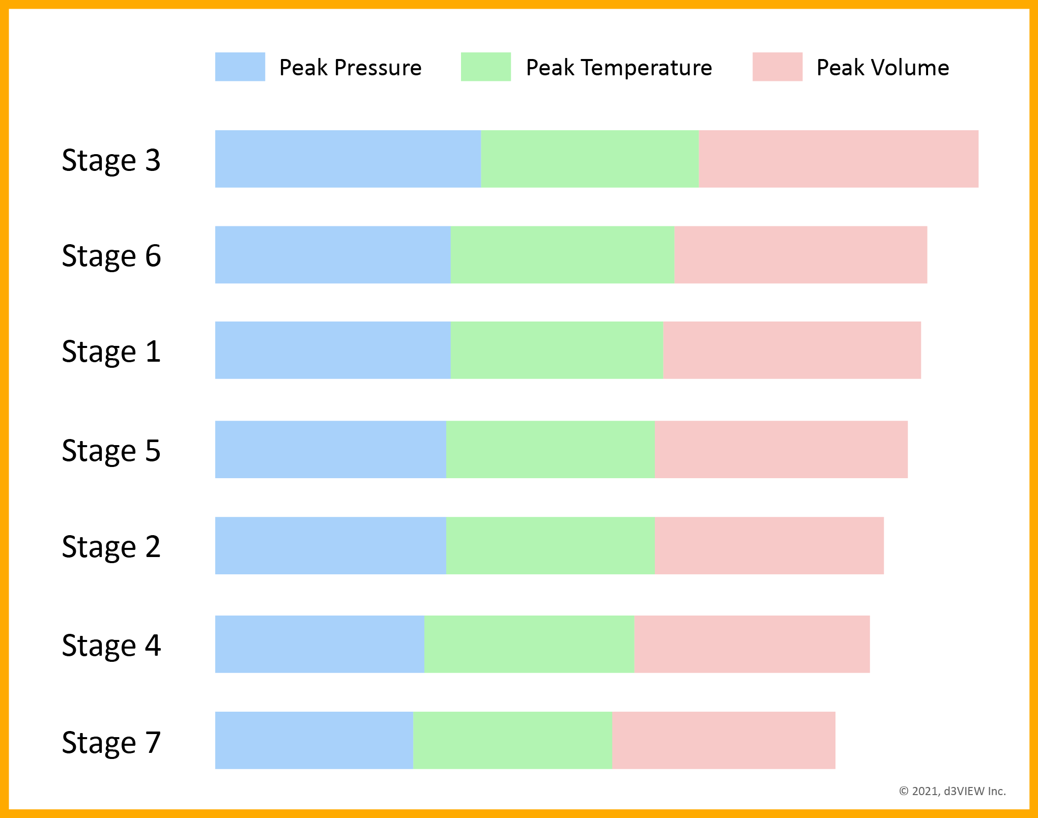
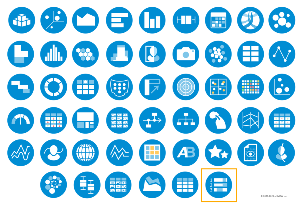
In addition to the 40+ visualizers, Simlytiks® now has yet another new way to visualize your data. The new Ranking Table visualizer presents your data in table format with sized and colored bars for quick and easy comparisons between tests, models, occurrences, specimens, data samples, etc.
Usually set up in descending order, you can employ Ranking Tables for performance-based comparisons. In the following image, for example, each stage of a test represents a row, with color-coded bars indicating the different recorded instances. The first stage has the highest values for each color.
Use the new Ranking Table visualizer with other Simlytiks® visualizers to add variety to your data exploration. An array of data visualization options aids in more efficient and in-depth data mining for better decision-making.
About Simlytiks®
The Simlytiks® application on the d3VIEW platforms illustrates your data into charts, graphs, infographics and animations to make exploring data easier, faster and more profound. Choose from an assortment of rich visualizer options which include figures such as multi-curve graphs, parallel line charts, summary tables and multi-dimensional radar plots. Utilize multiple pages and layouts to explore abundantly, and report or share your findings with just a few clicks.
For more information about our Simlytiks® application, please visit our Simlytiks page here.


