With over 12 applications on the d3VIEW platform, differentiating them could get a bit challenging when you are in the thick of things. That’s why each application has a unique icon and color to distinguish one from the others. And now, these individualized icons and colors are present on their respective application page header.
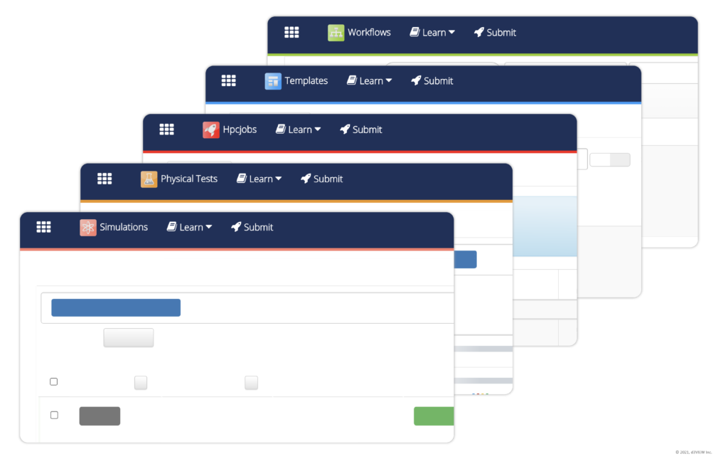
As shown in the above image, the application pages now present their icons on their page headers next to their names. The headers are also highlighted at the bottom in their unique app colors. This shows users what application page they have landed on.
Adding these indicators especially assists when identifying between pages that have similar layouts. Some sister pages include: Simulations and Physical test – set up in congruent data tables with comparable columns such as ID, name, date created, etc – as well as Workflows and Templates – displayed in resembling lists with name, attributes and a hover feature for commands. Having indicators for the application at the top allows for consistency throughout the platform and in-turn eases platform use resulting in better user experience.


