Did you know d3VIEW has over 900 workers for employing data extractions and scientific processes? Many of these workers also correspond to transformations that can be applied individually to data responses, particularly curve responses. Curves may very well be the most used way to visualize scientific data which is why curve transformations can be so powerful. Let’s take a sneak peak at our favorite ones on the platform.
Curve Scale
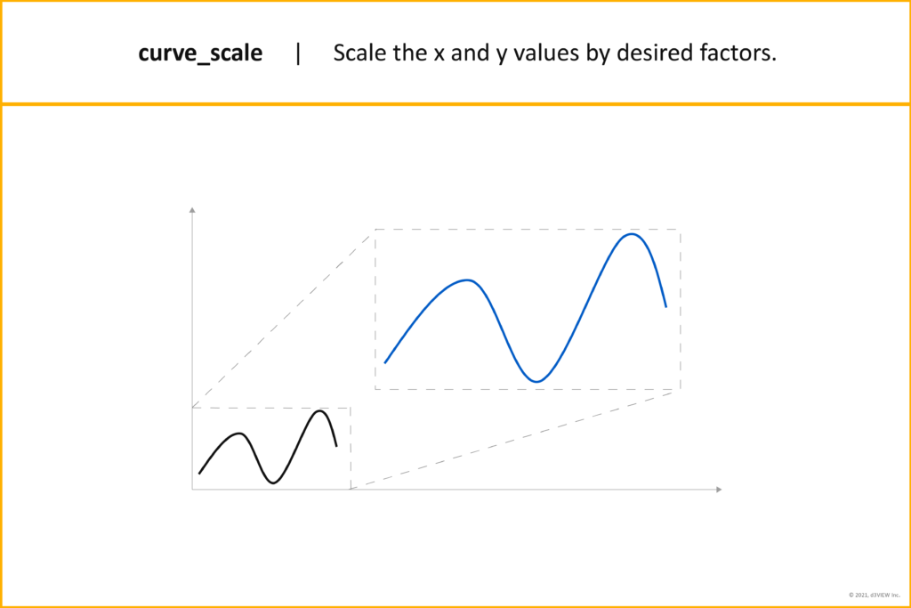
Main way it is used: Scaling a curve helps when y and x values have different orders of magnitude. Plotting a curve that has y values in the thousands but x values between 0 and 1 can be difficult to analyze.
Curve Filter
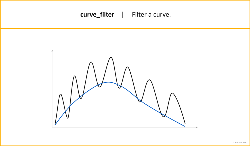
Main way it is used: Filtering a curve simplifies it to reveal patterns and changes in data. Curve filtering is a loose version of smoothing and used to understand data trends instead of detail.
Curve Derive
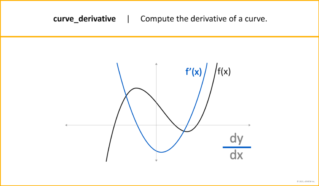
Main way it is used: A derivative of a curve in its simplest definition is the instantaneous rate of change. This can especially help with optimization or with marginal analysis.
Curve Reverse Points
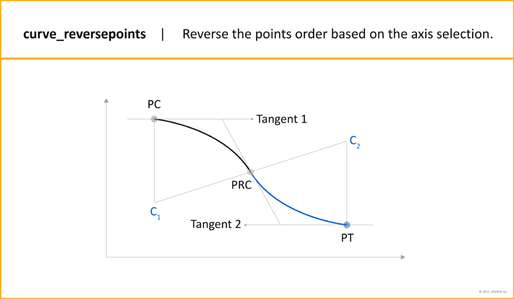
Main way it is used: Reversing the points of a curve supports viewing data in a different perspective. For example, switching the x and y values could visually correspond with how a test is performed in the physical, making it easier to understand.
Curves Overlay
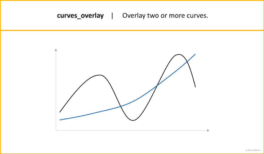
Main way it is used: Overlaying curves allows for easy comparison by plotting multiple curves together. This is a simple and efficient way to understand how data curves relate to each other.
Curves Crossplot
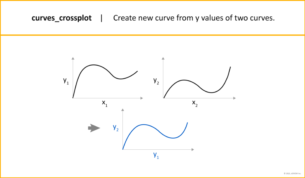
Main way it is used: Cross-plotting two curves allows us to examine differences between the two sets of data. For example, the difference in y values of two durability tests performed on a prototype could uncover inconsistencies in materials.
Use these curve transformations as workers in the d3VIEW’s Workflows application or use them individually on curve responses from simulations or physical tests to get the most out of your data.


