d3VIEW’s Simlytiks application offers over 40 different possibilities for exploring your data through our rich visualizer library. Simlytiks visualizers are exactly what they sound like: data presented into visual displays such as graphs, charts and even animations. Here, we’ll go over some of our favorites and show a sneak peak at what they can do.
 Bar Chart
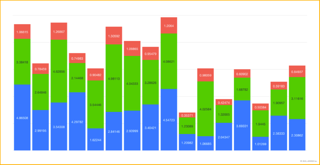
Who doesn’t like the simplicity of a colored bar chart? Stack multiple values for each bar which are colored coded and show the respected values. There is also a horizontal version of this visualizer if you prefer to view your data from left to right.
 Newton Curve Visualizer
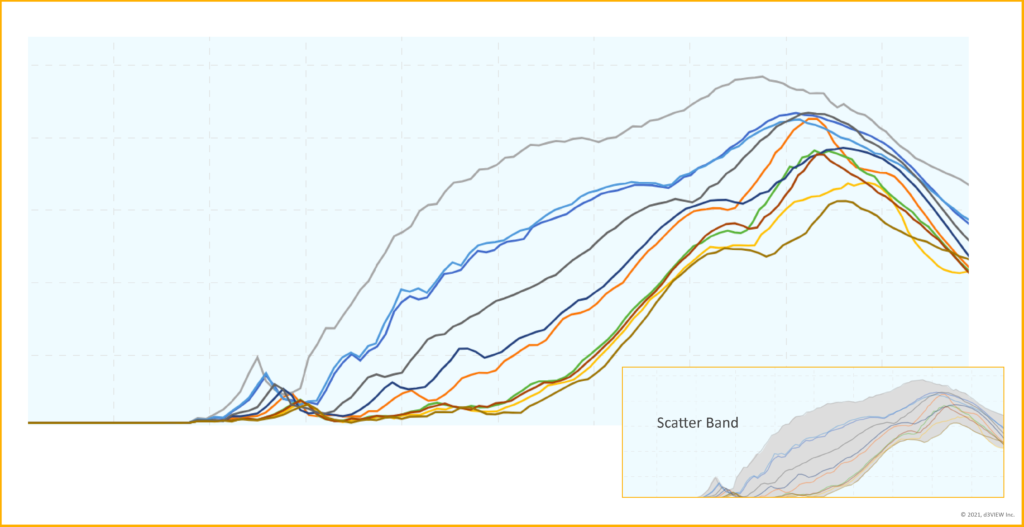
Visualizing curves is crucial for scientific data which is why this visualizer can basically be considered its own application. Highlight, filter or drag curves easily and even change the view type to options such as points, scatter band or curve difference. Newton integrates anywhere on the platform where curve responses or outputs are present.
 Summary Table
An advanced data table, summary table allows you to input just about any kind of data into its cells. Add a data response, an image or even another visualizer into any cell.
 Sparkline Matrix
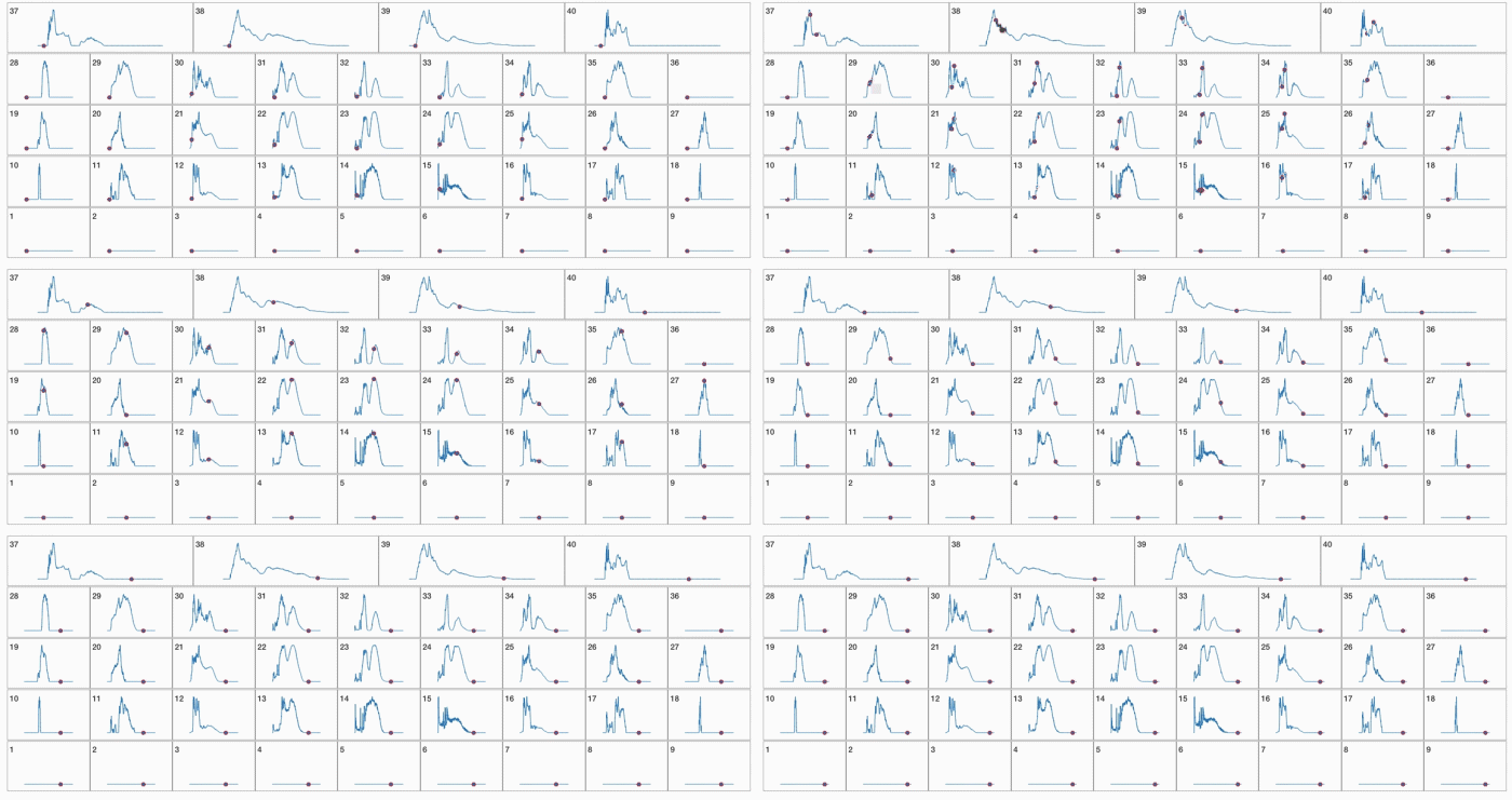
This visualizer illustrates curve responses, such as forces, in a matrix so you can explore how they act in a system. The matrix uses animation features to help you understand the system further.
 IIHS Intrusions
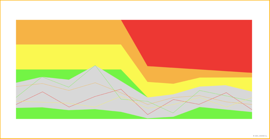
Simlytiks has field specific visualizers such as the IIHS chart used for determining vehicle ratings. This chart demonstrates a way Simlytiks helps with making informed decisions for improving designs.
To learn more about the Simlytiks application, please visit this page.
To learn about another Simlytiks visualizer, ranking table, visit this blog post.


