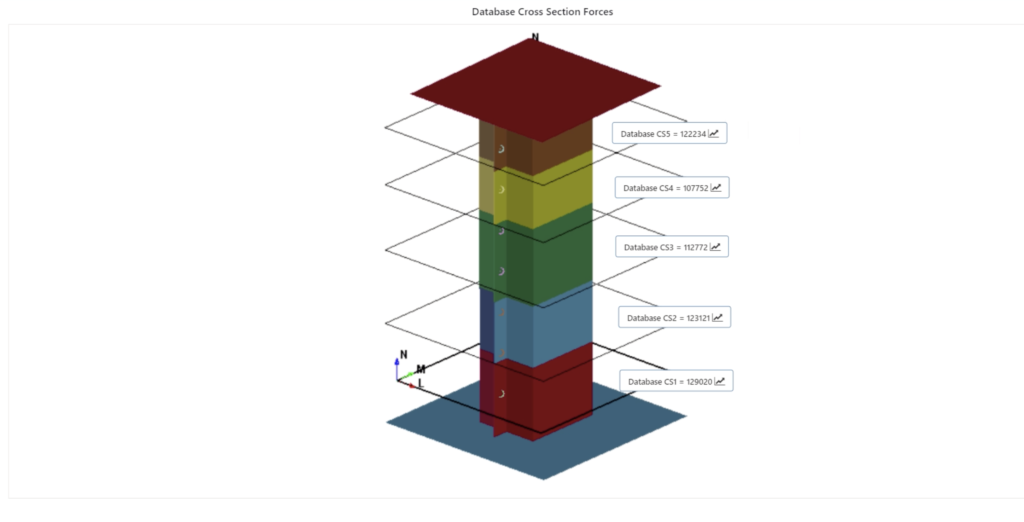
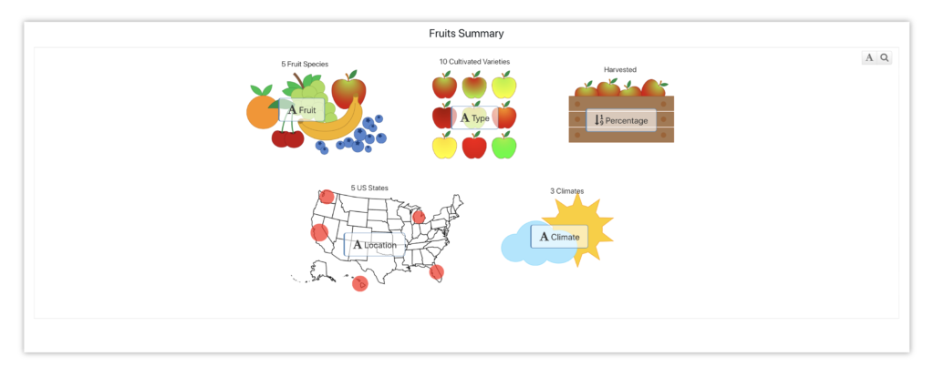
Simlytiks application in d3VIEW converts raw data into descriptive analytics using a variety of visualizers to facilitate a quick understanding of the data and to aid in decision making. Among the library of visualizers, one that belongs to the category of InfoGraphics is the newest addition called Image Annotator. It is one of the powerful visualizations in Simlytiks that helps associate data with meaningful images. Infographics has been seen as early as 25,000 years ago in the Serra Da Capivara caves of Brazil and it not new for humans to use data associated with Images to describe information. In this post, we walk you through the aspects of creating a visualization using ImageAnnotator using realistic simulation and non-simulation data to demonstrate its flexibility to work with a variety of data formats and types.
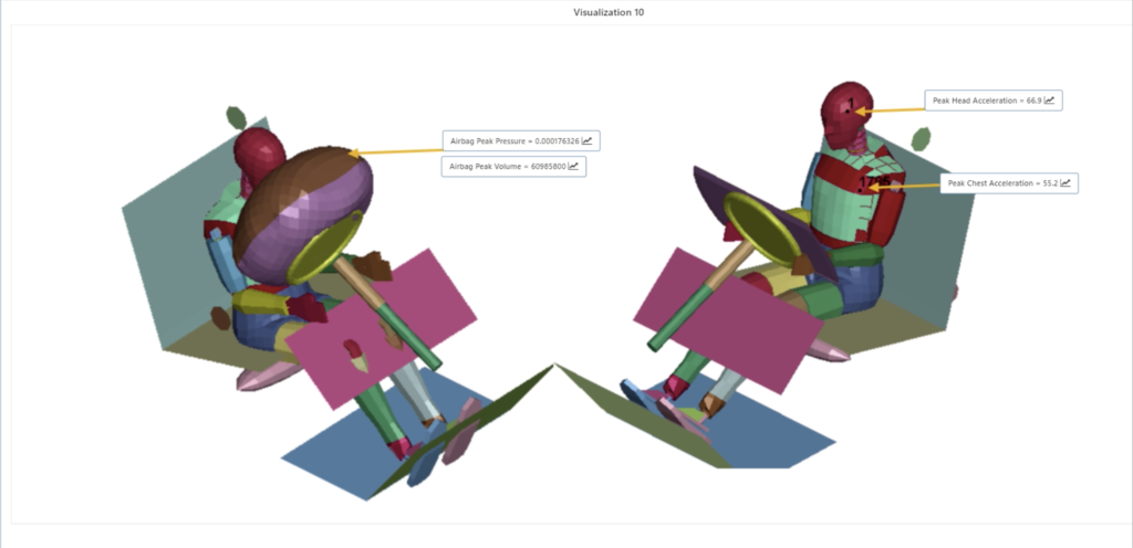
In the example below related to occupants and their safety, if we need to view key metrics pertaining to an occupant model such as Peak Head/Chest Acceleration or Peak Airbag Pressure or Volume, we can use an Occupant image and drag and drop the required key-performance-indicators (KPIs) which would result in an image as shown in Figure 1.0 below. As you see, now, we can visually associate the data to its measuring location and eliminate the need for time needed to associate the data to its location without this feature.
Let’s walk through an example in steps to creating them.
Creating an Image Annotator Visualization
- Open d3VIEW platform. Click on Application menu available towards left top corner to view list of applications.
- Click on Simlytiks logo to open the Simlytiks application page.
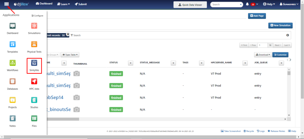
- There are 2 ways to create a dataset in Simlytiks as shown in Figure 1.2
- Using Drop or Click to Add Files Box (a) or
- Using New Dataset (b) button
- Click on Drop or Click to Add Files Box to upload a file from local system.
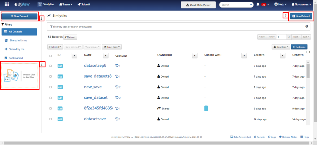
- Click on New Dataset to open Create New Simlytiks Dataset modal. Within this modal, there are 4 ways to create a dataset.
- Import From File to upload file from local system (i)
- Connect to a Database to create dataset using databases (ii)
- Simulations & Experiments to create dataset from simulations (iii)
- Sample Datasets to create dataset from available sample datasets(iv)
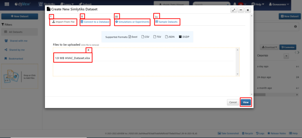
For this illustration, we are now creating dataset using Import From File option and choosing ‘HVAC_Dataset’ that is available in the local system. The Fig 1.3 above shows the uploaded file(a).
- Click on View to complete creating a Dataset.
- Go to Classic View. Click on New Page to add a page to the dataset.
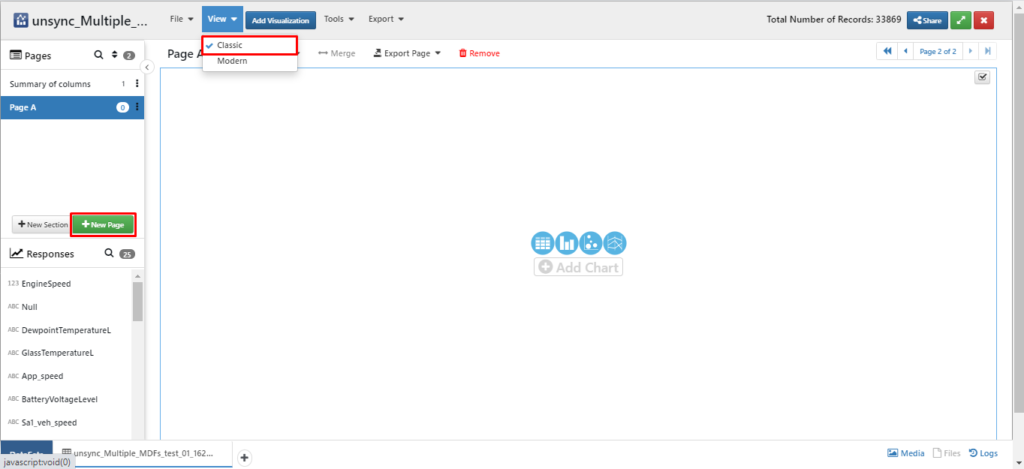
- Alternatively, click on Modern within View to access modern view of simlytiks page. Click on Add Page to add new page.
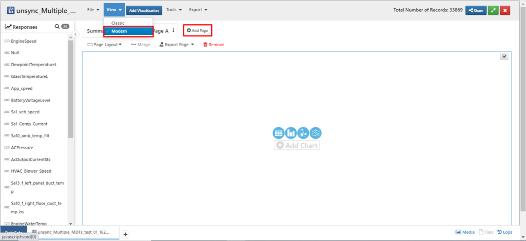
- In this example, we are accessing Classic view.
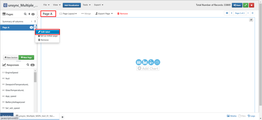
- Click on page name (Page A) or the 3 vertical dots to display available options. Click on Edit label to change edit page name.
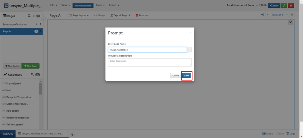
- Type new page name and click on Save to update page name.
- Create a new visualization in one of the 3 ways – Clicking on Add Chart or Add Visualization or Run Wizard buttons.
- For the current illustration, let’s create a new visualization by clicking on Add Visualization button.
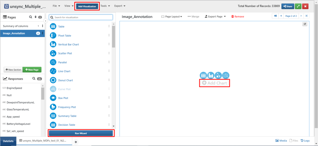
- Using the search window, search for Image annotator visualizer from the list of 40+ available visualizers.
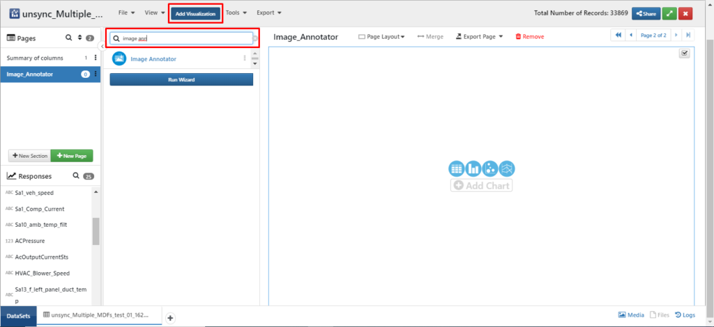
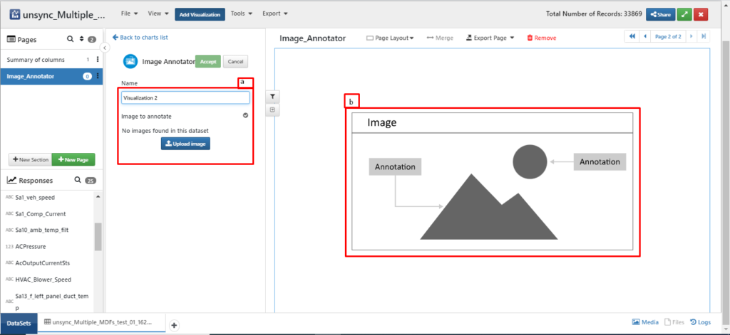
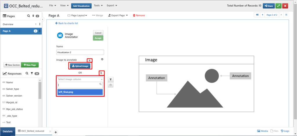
- We can upload image for the visualization in 2 ways.
- Click on Upload Image(a) as in Fig: 1.9 to upload an image from local system.
- Click on Select image column(b) dropdown to choose image from a set of available images. This will be enabled if the dataset has any images in it.
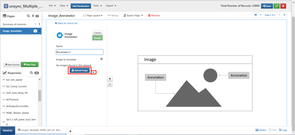
- Now, we are uploading an image from local system using Upload Image(a) in Fig 1.10.
- Once the image is uploaded, provide name for the visualization. Ex: Annotator. Click on Accept button to create/add visualization to the Simlytiks page.
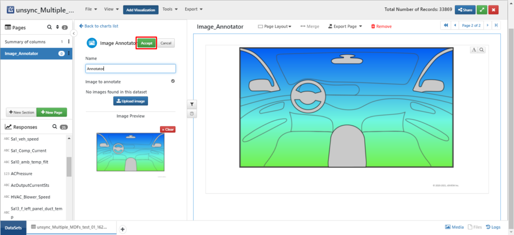
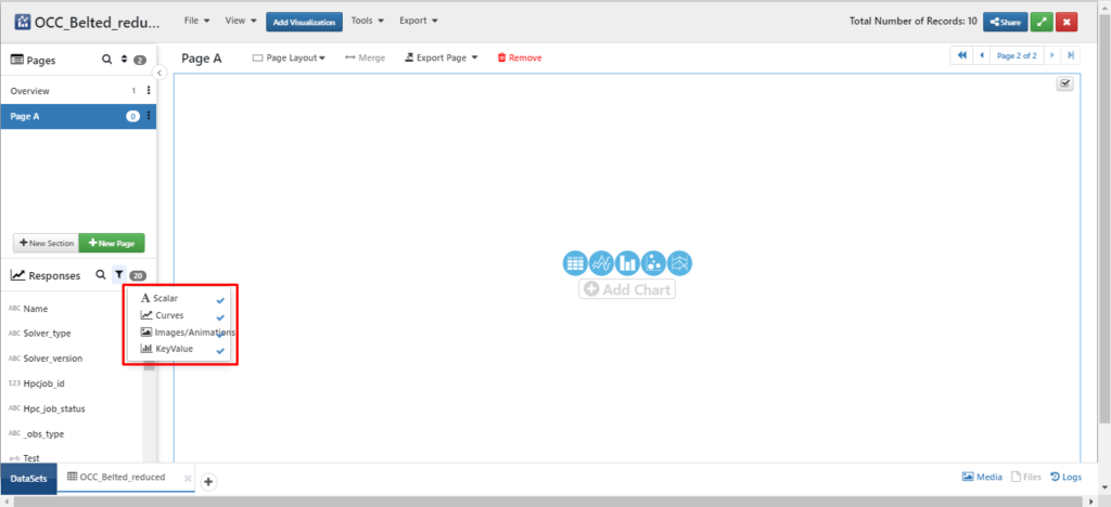
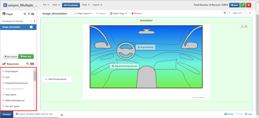
Once an image is added, Click and drag the required response to drop it on the image from left side panel. Please note that we can drop curve responses, scalar responses, Images and Key value.
Edit Responses’ settings
Once the required responses are dragged onto the image, we can change the settings for them.
- Click and drag response to change its position.
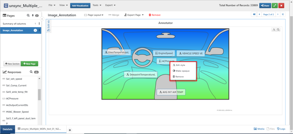
- Right click on the response to see more settings like, Edit style, Make opaque, Remove.
- Click Edit style to change settings like, Font size, Font style, Font color, Italics, Bold and underline for the response name.
- Click Make opaque to make transparent background or Opaque background.
- Click Remove to delete added response.
- Click on A(Toggle annotations) available at the right top corner of the chart to view and add Arrow, shapes, text settings.
- Click Arrow icon to add arrow to the chart which helps in pointing.
- Click and drag arrow to change its position in the chart.
- Click on Dotted circle at the top of the arrow and rotate to change its direction.
- Click on Dotted circle at the bottom of the arrow and drag to change its size.
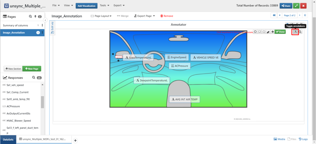
- Click on Circle icon or other shapes to highlight particular area in the image.
- Click anywhere on the chart to add Text which helps in naming if there are multiple images in the chart or, if we want to assign a curve to the chart.
- Type text and make other changes like Font size, Font style, Font color, etc.
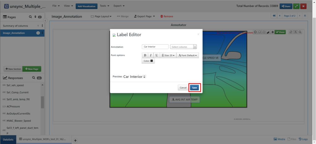
- Click on Assign curve dropdown to assign selected curve for the text. To be able to enable this option, we should have curve responses in the dataset.
- Click on Save to view text on the image.
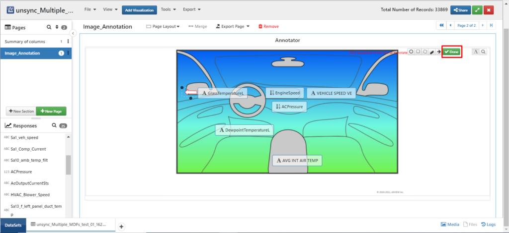
- Click on Done available at the top right corner to exit from edit mode and save settings.
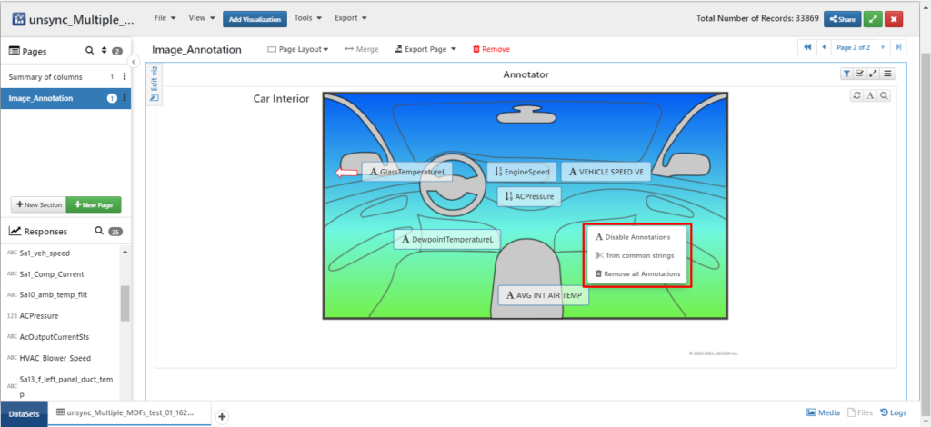
We have other editing options like, Disable Annotations, Trim common strings, Remove all annotations when we right click anywhere on the image. These settings are global meaning they are applied to all the added responses.
- Click on Disable Annotations to hide all annotations.
- Click on Trim Common Strings to remove common strings in all the responses which makes response name’s shorter.
- Click on Remove All Annotations to delete all the added responses for the image.
Interacting with annnotated data
- Once we have completed editing the annotations, we can now view the annotated data.
- Click on Response (For ex: GlassTemperature) to view the details corresponding to that response.
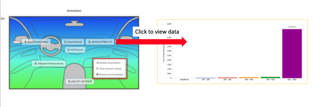
- In this illustration, we have added Text and Number responses of Scalar type. We can have a detailed view of these responses by clicking on them.
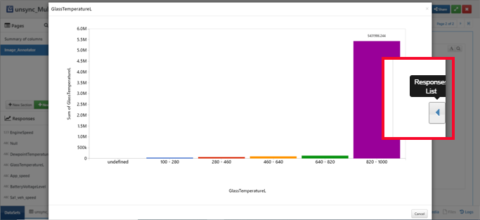
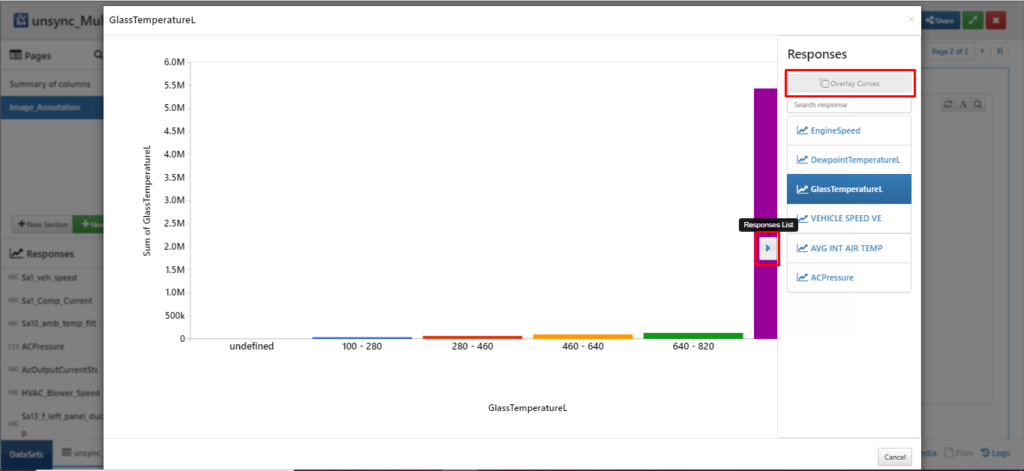
- Alternatively, click on Responses list button available towards the right hand side of the response page. In this toggle window, we can get to know response that is currently being viewed in detail. Click on all available responses to view them in detail.
- Click Overlay curves button available at the top of the Response List. Select any of the available responses to overlay. To be able to overlay the responses, we should have responses of different parameters in curve type responses.
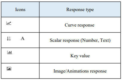
- Below table shows types of available responses along with their icons.
These are the main steps carried out while creating image annotations, editing added responses and viewing the added responses.
More Examples
Automobiles
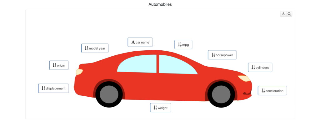
The Automobiles dataset explores basic statistics of cars. Here is an image annotation showing a summary of these statistics which include MPG, cylinders and weight.
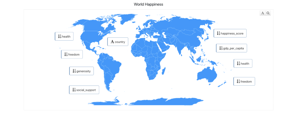
2020 World Happiness
The 2020 World Happiness dataset explores happiness score values based on a multitude of variables. Here is an image annotation showing the summary of these factors for over 100 different countries.
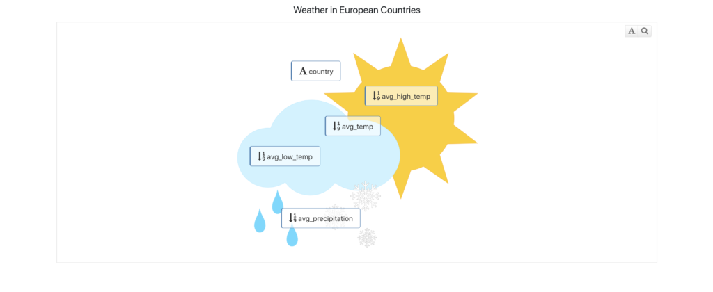
Average weather
The Average Weather dataset explores yearly averages for European countries. Here is an image annotation showing average temperature, average high, average low and average precipitation.
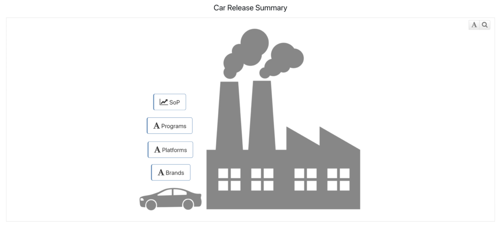
Car Release
The Car Release dataset explores the release of car brands based on programs and platforms. Here is an image annotation showing the release summary.
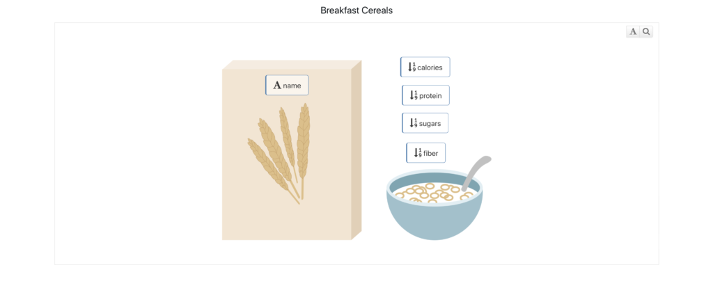
Breakfast Cereals
The Breakfast Cereals dataset explores nutritional values of popular cereals. Here is an image annotation showing calories, sugars, protein and fiber.
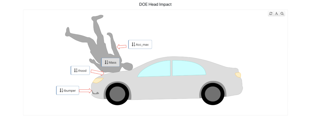
Head Impact
The Head Impact dataset explores the crash analysis on pedestrian head impact. Here is an image annotation showing hood and bumper forces, mass and peak acceleration.
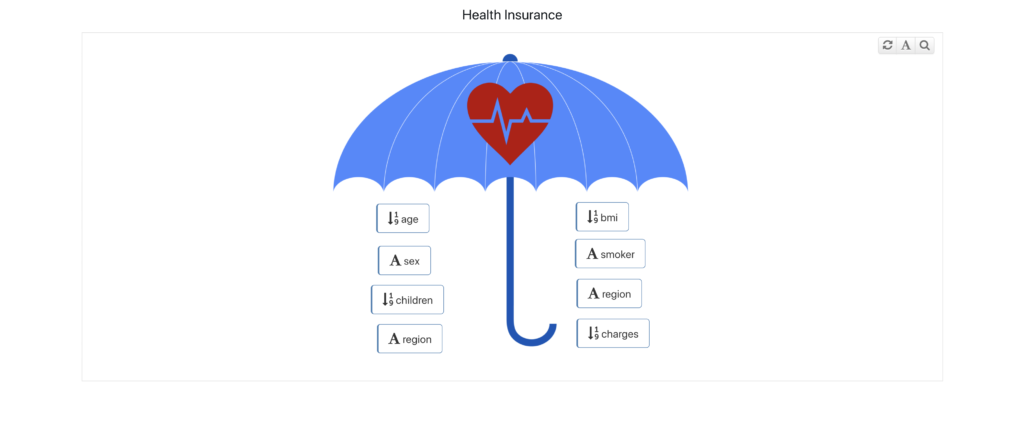
Insurance
The Insurance dataset explores insurance holders based on certain variables. Here is an image annotation showing a summary of these insurance categories.
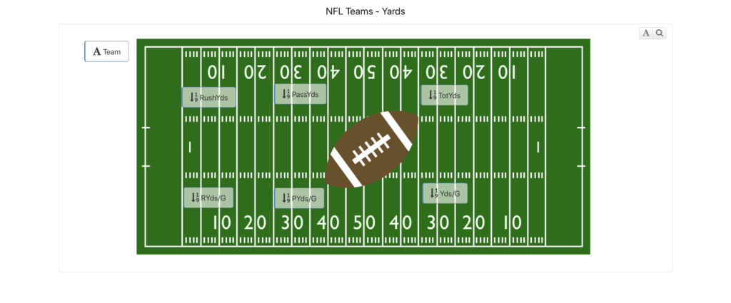
NFL Teams
The NFL Teams dataset explores the points and yards statistics for each team. Here is an image annotation showing yard stats.
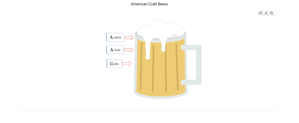
Craft Beers
The Craft Beers dataset explores ABV values and types for American craft beers. Here is an image annotation showing the ABV and beer style.
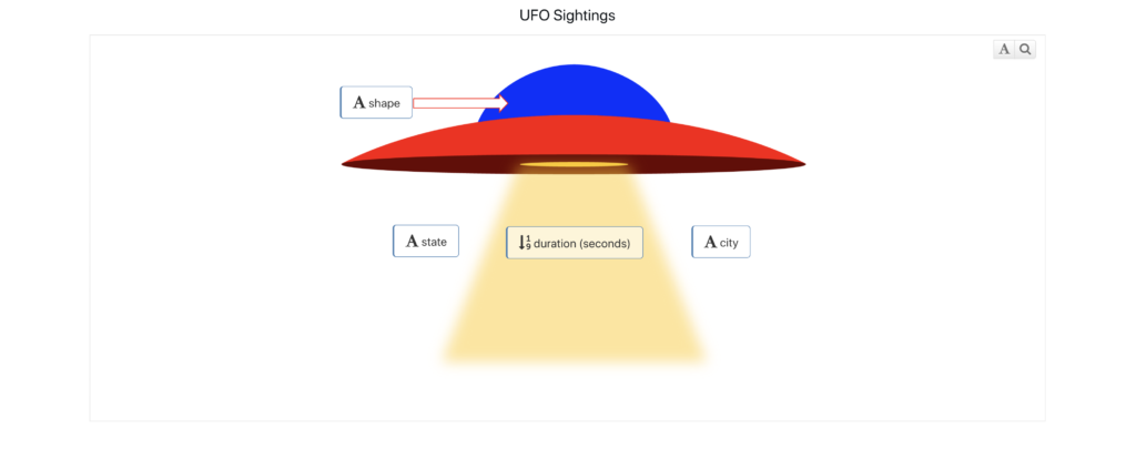
UFO Sightings
The UFO Sightings dataset explores location, duration, shape and comments of the sightings. Here is an image annotation showing the location, duration and shape.
Diabetes
The Diabetes dataset explores factors that may cause diabetes. Here is an image annotation showing pregnancy factors and the diabetes pedigree function.

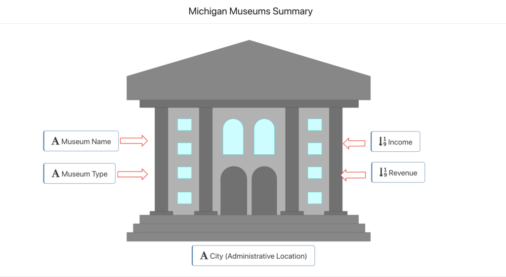
Michigan Museum
The Michigan Museums dataset explores different types of museums and their finances. Here is an image annotation showing city, type, income and revenue.
Rail Model
The Rail Model scientific dataset explores an axial crush material calibration simulation. Here is an image annotation for the forces at play during the crush.
